Ever scrolled through a car mag or looked at the pics on an auto website and thought wow, those are just pictures… they’re art? But what makes them so good? Sure the cars are beautiful but there’s another key element at play: color grading. In car photography color grading can turn a good photo into a showstopper. Let’s get into what color grading is, why it matters, and how it can help your car photography.
What is Color Grading?
First off—what is color grading? Simply put, color grading is the process of adjusting and enhancing the colors in an image to create a certain mood or style. It’s not just about making the colors look better; it’s about making them look right for the story you’re trying to tell. Whether you want a photo to feel warm and cozy, cool and sleek, or vibrant and energetic, color grading is the tool that does it.
In car photography color grading goes beyond just adjusting brightness and contrast. It’s about fine-tuning every element of the image—from the paint on the car to the sky in the background—to make everything work together. The result? An image that’s technically perfect and emotionally impactful.
Why Color Grading Matters in Car Photography

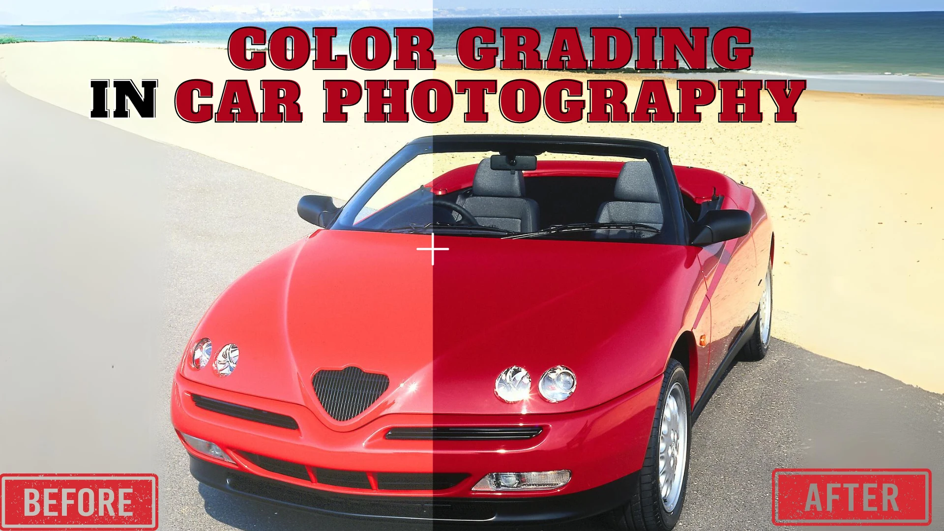
So why is color grading such a big deal in car photography? Let me illustrate (pun intended). Imagine you’re shooting a luxury sports car. The car is sleek, powerful, and attention-grabbing—but when you look at the raw images they don’t quite capture the car’s soul. The colors are off, the lighting isn’t as dramatic as you wanted and the overall image feels flat. This is where color grading comes in.
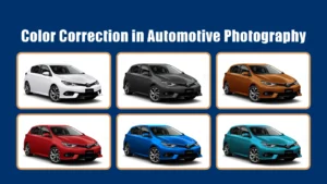
Set the Mood
The colors in an image can change the mood. For example, a warm golden color can make an image feel nostalgic and cozy—perfect for a classic car with a retro vibe. A cool blue tone can make the image feel modern and high-tech—great for an electric car. With color grading, you can dial in the exact mood you want and make sure the image conveys the right emotion.
Make the Car’s Bits Pop
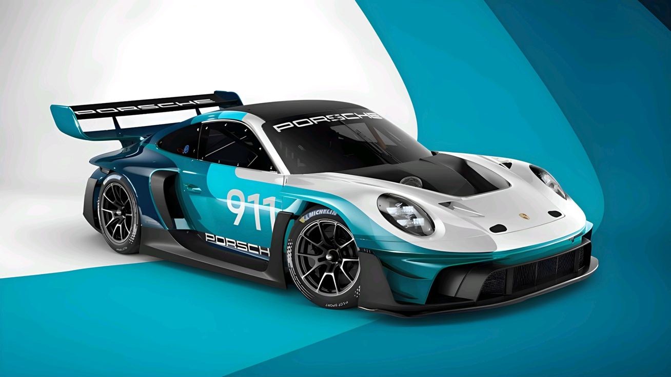
Color grading also helps to accentuate the car’s features. Maybe the paint has a subtle metallic flake that’s getting lost in the raw image. By adjusting the highlights and shadows you can make that flake pop and make the car look more dynamic. Similarly, color grading can make the interior details, the shine of the wheels, or the texture of the tires stand out that might not otherwise.
Series Consistency
If you’re shooting a series of images, color grading is key to consistency. Let’s say you’re shooting a car in different locations—on the road, in a showroom, and at sunset. Each of these locations has different lighting and color. With color grading, you can make all the images feel like they’re part of the same set, with the car looking great in every shot.
Color Grading Process
Now that we’ve covered why color grading is important, let’s get into how it’s done. While the process can be complicated, here’s a simplified breakdown of the steps involved in color grading car photography.
Start with a Balanced Base
Before you even start color grading, make sure your image is balanced in terms of exposure, contrast, and white balance. This is your foundation to work from. If the image is too dark, too bright, or has an off-color temperature, these should be fixed first.
1. Highlights and Shadows
Next, you’ll want to adjust the highlights and shadows to bring out the details in the car. For example, if the car’s paint is reflective you might want to reduce the highlights slightly to prevent glare and boost the shadows to reveal more depth. This is key to giving the image depth.
2. Fine Tune the Colors
This is where the magic happens. Use color grading tools to adjust the hue, saturation, and luminance of specific colors in the image. For instance, you might want to enhance the color of the car’s paint to make it more pop or tweak the blues in the sky to match the car’s overall tone. Be careful not to overdo it—subtle adjustments can often have the biggest impact.
3. Create a Color Grade Look
Once the individual elements are adjusted you can apply an overall color grade to the image. This could be a warm tint to give the image a sunset feel or a cool tone for a more futuristic look. Many photographers create “looks” that they apply to all their images to establish a style.
4. Review and Refine
Once you’ve applied your color grade take a step back and review the image. Does it feel like the mood and style you were going for? Are all the elements—car, background, light—working together? Sometimes a little refinement is needed to get it just right. Don’t be afraid to go back and adjust until it feels perfect.
Color Grading Tools
What tools do you need for color grading? Good news, there are plenty to choose from.
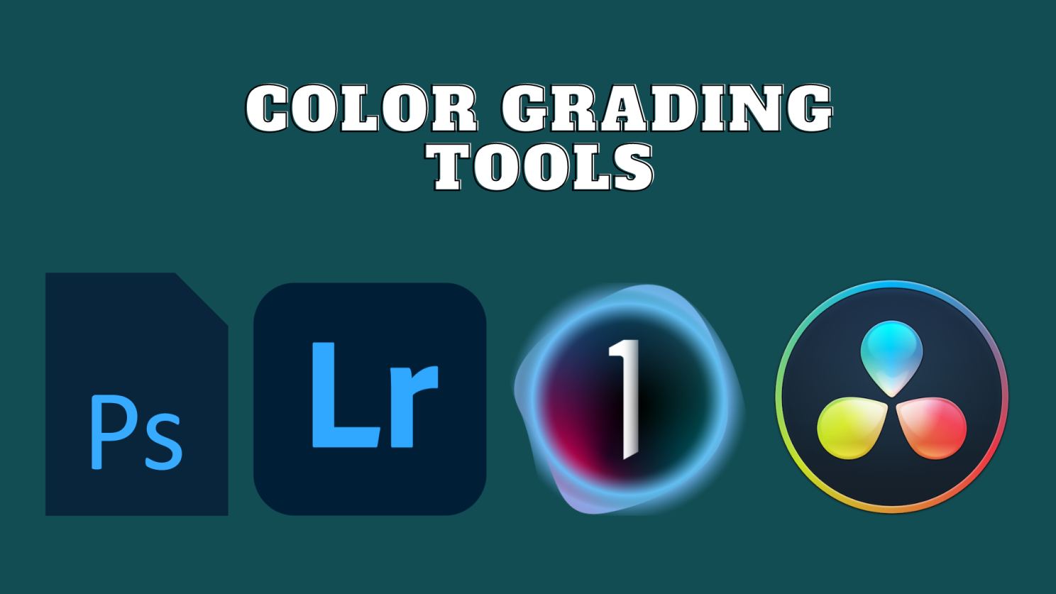
Adobe Lightroom and Photoshop
Adobe Lightroom is a favorite among photographers for its intuitive color grading tools. With Lightroom, you can easily adjust the colors, tones, and overall look of your photos. Photoshop, on the other hand, offers more advanced color grading capabilities, allowing for fine-tuned adjustments and more complex edits.
Capture One
Capture One is another popular choice, especially for professionals. It offers excellent color grading tools, including advanced color wheels and the ability to create custom color profiles. Capture One is known for its superior color rendering and is particularly favored by those working with high-end automotive photography.
DaVinci Resolve
Originally designed for video color grading, DaVinci Resolve has become a go-to for photographers as well, thanks to its powerful color correction tools. It offers a comprehensive set of features that allow for precise color adjustments and is ideal if you’re working on both stills and video.
Tips for Effective Color Grading
To wrap things up, here are a few tips to help you master color grading in car photography:
Understand the Brand:
If you’re shooting for a specific car brand, make sure your color grading aligns with their identity. A luxury brand might prefer a more polished, sophisticated look, while a sporty brand might favor vibrant, dynamic colors.
Be Subtle:
Less is often more when it comes to color grading. It’s easy to get carried away, but subtle adjustments tend to produce the most natural and appealing results.
Match the Environment:
Consider the environment in which the car is placed. The color grading should complement the surroundings, whether it’s an urban setting, a scenic landscape, or a showroom.
Stay Consistent:
If you’re working on a series of images, consistency is key. Apply similar color grading across all photos to create a cohesive collection.
Conclusion
Color grading is an essential skill for anyone serious about car photography. It’s the secret sauce that can elevate your images from good to unforgettable. By understanding the principles of color grading and practicing with the tools available, you can create stunning automotive photos that not only showcase the car but also evoke emotion and tell a story. So, the next time you’re behind the lens, remember—the colors you choose can bring your car photography to life in ways you never imagined!