In the digital age, a car dealership’s online presence is just as important as its physical showroom. Social media platforms provide an excellent space to showcase your inventory, engage with potential customers, and promote deals. However, with so much content vying for attention, a well-designed social media poster design can make all the difference in grabbing attention and driving engagement. Crafting the perfect social media poster for your car dealership requires a blend of creativity, strategy, and attention to detail. Here’s how you can design engaging and effective posters to boost your dealership’s online presence.
Table of Contents
Toggle1. Focus on High-Quality Car Imagery
At the heart of any great car dealership poster is stunning imagery. A car dealership’s primary asset is its vehicles, and they should be showcased in the best light possible. High-resolution, professional-quality images are essential. The car should be the focal point, with an emphasis on clean, crisp shots that highlight its best features, such as the sleek exterior, luxurious interior, or cutting-edge technology.
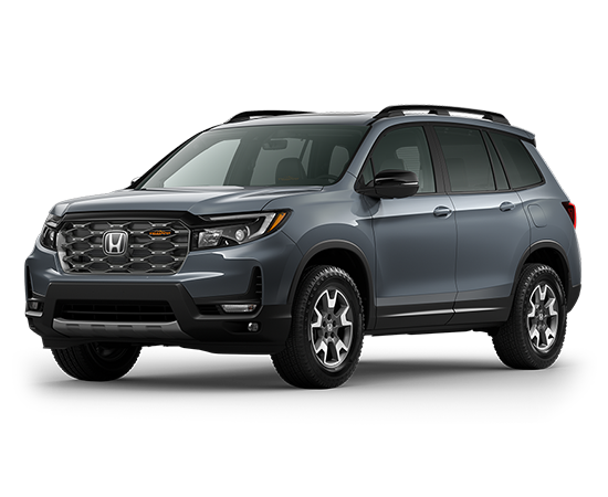
Design Tip: Use lifestyle photos to appeal to emotions. For example, a car driving along a scenic highway, or a family loading their vehicle for a road trip, helps potential buyers visualize how the car fits into their lives. Avoid cluttering the poster with too many vehicles—focus on one or two to create a clear visual impact.
Pro Tip: Make use of close-up shots to highlight unique selling points, like chrome detailing, LED headlights, or plush seating. Let the viewer experience the car’s quality through your images.
2. Keep Your Design Clean and Simple
A cluttered design can overwhelm your audience and make your message hard to understand. Simplicity in poster design is key to making the car and your message stand out. Stick to clean layouts, minimalist backgrounds, and ample white space to ensure that your message doesn’t get lost in the noise.
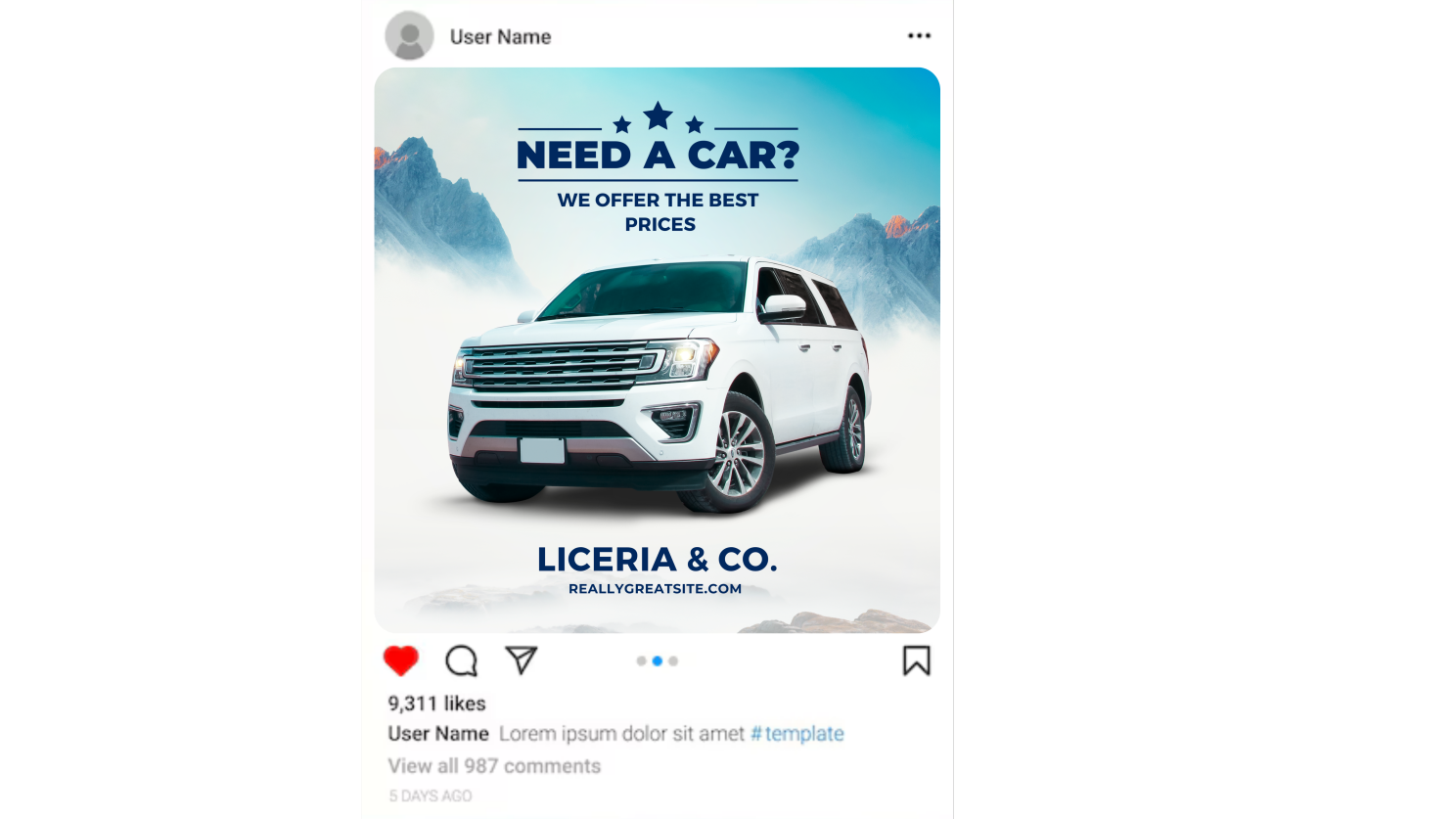
Design Tip: Limit your use of text to essential information—such as the car model, price, or promotional offer. Use bold, easy-to-read fonts, and ensure your text contrasts well with the background for maximum readability.
Pro Tip: Include a strong call to action (CTA) like “Schedule a Test Drive,” “Limited Time Offer,” or “Explore Our Inventory.” Make the CTA stand out by using vibrant colors or buttons to draw attention.
3. Incorporate Your Dealership’s Branding
Your dealership’s branding should be consistent across all social media posts, including posters. Incorporate your logo, brand colors, and fonts to create a cohesive look that reinforces your identity. This helps build brand recognition and trust with your audience.
Design Tip: Position your logo strategically—usually in a corner or at the bottom—to ensure it’s visible without overpowering the car imagery. Use your dealership’s brand colors as accents, such as in the text, borders, or icons, to keep the design aligned with your overall aesthetic.
Pro Tip: Consider using your tagline or slogan in the poster to further strengthen your dealership’s brand message. For instance, if your slogan is “Driven by Excellence,” incorporate that into the design to complement the vehicle’s attributes.
4. Highlight Special Offers and Promotions
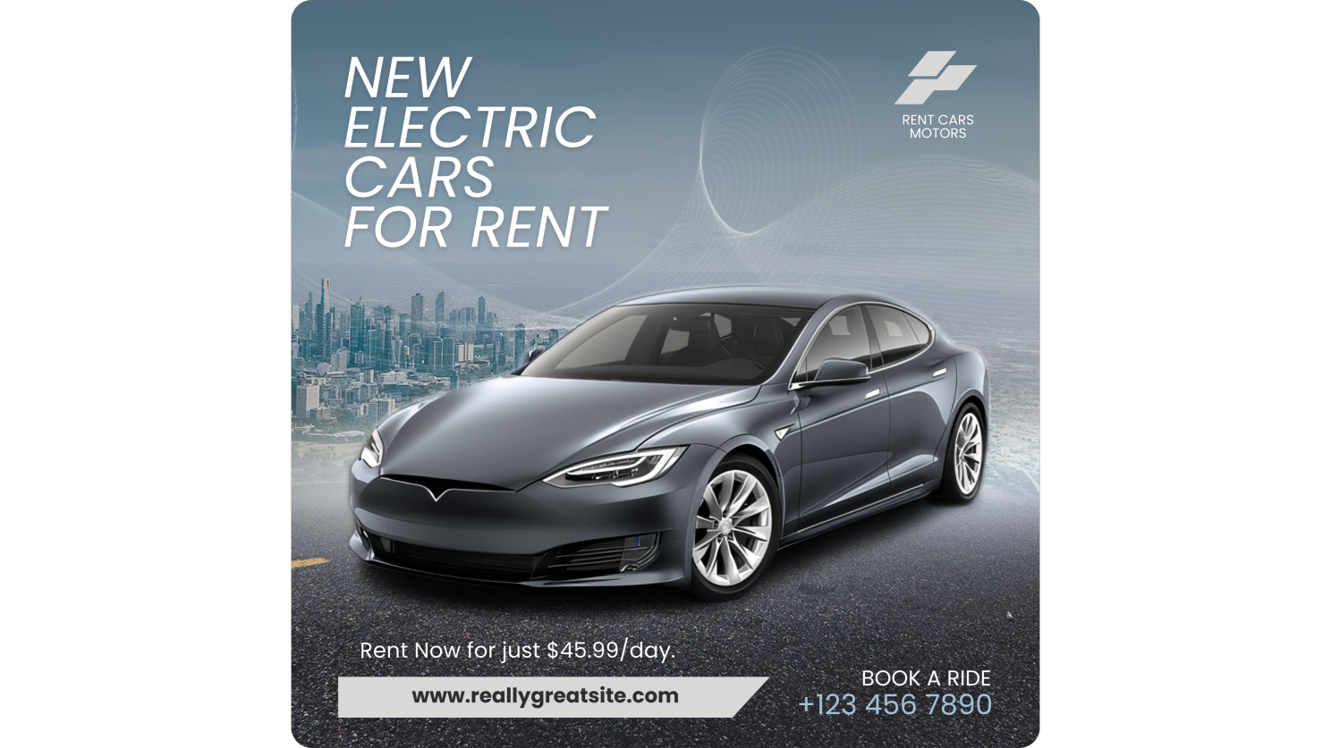
Promotional posters are a fantastic way to draw in potential buyers, especially when promoting time-sensitive offers. If you’re running a sale, offering limited-time discounts, or launching a special financing deal, make sure the promotion is front and center on your poster.
Design Tip: Use bold fonts and vibrant colors to highlight the offer, ensuring that it captures attention. For example, use bright red or yellow for phrases like “Huge Savings!” or “0% Financing Available.” Place the offer prominently, either at the top of the poster or overlayed on the car image, without obstructing key visual elements.
Pro Tip: Adding urgency with phrases like “Only 2 Days Left!” or “Ends Soon!” can create a sense of FOMO (fear of missing out), encouraging immediate action.
5. Use Text Wisely with Eye-Catching Fonts
Your font choices are just as important as the images you use. Fonts should be legible and consistent with your dealership’s tone and branding. Use large, bold fonts for headlines and key details like model names, prices, or offers, while smaller, simpler fonts can be used for additional information.
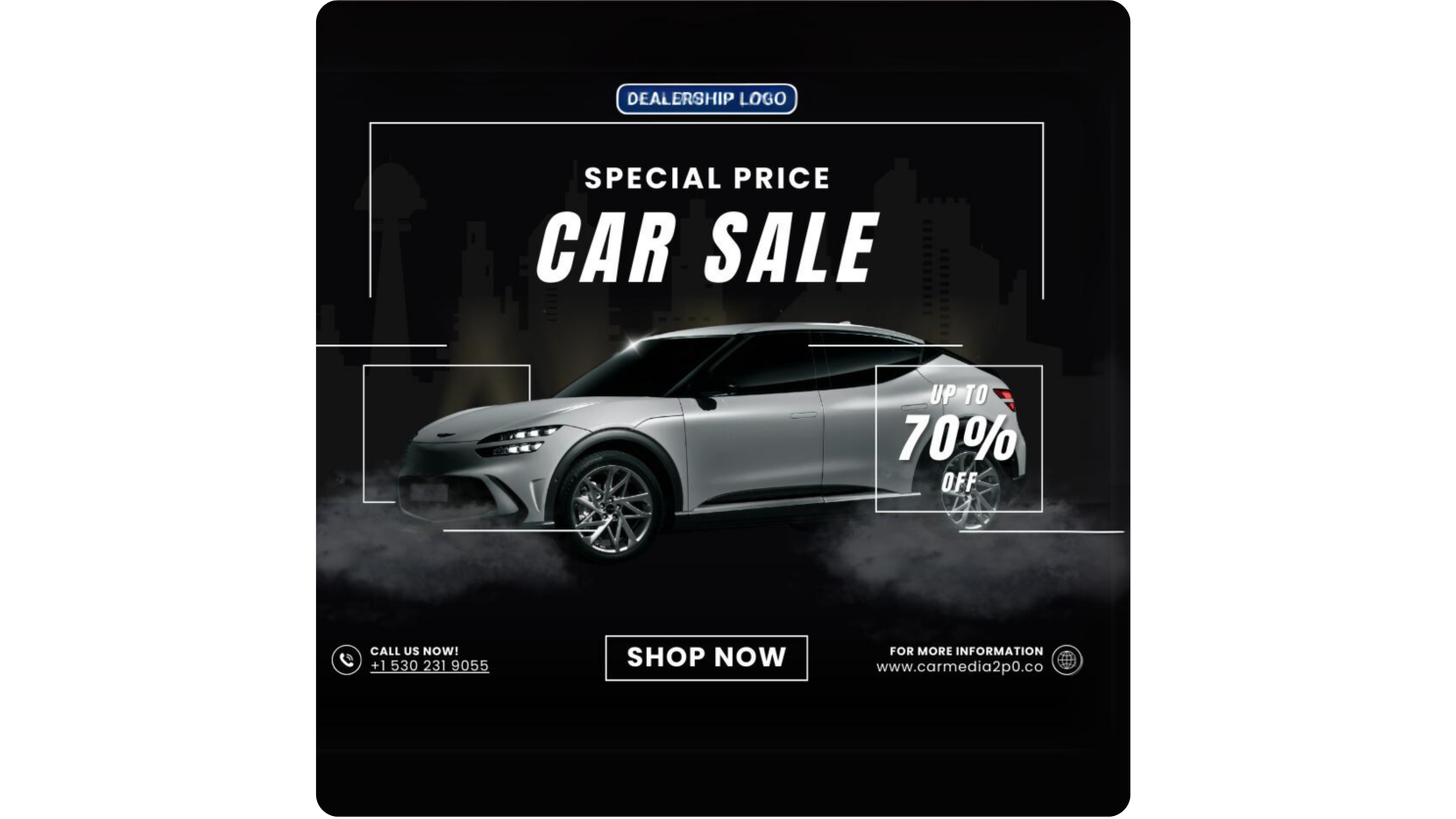
Design Tip: Stick to a maximum of two fonts per design to keep the poster visually cohesive. Mixing too many fonts can create a confusing or unprofessional look. Try pairing a bold sans-serif font for headlines with a clean, modern font for supporting text.
Pro Tip: Experiment with text placement to create a dynamic design. Diagonal or vertical text, for example, can add a creative flair while guiding the viewer’s eye through the poster.
6. Leverage Colors to Evoke Emotion
Color plays a significant role in how your audience perceives your poster. Colors can evoke emotions, convey urgency, and guide the viewer’s attention to key elements. For car dealerships, you may want to use bold, confident colors like blue, red, or black to convey trust, energy, or luxury, respectively.
Design Tip: Use contrasting colors to make your text stand out. For example, white text on a dark background or black text on a bright color ensures readability while creating a striking visual effect.
Pro Tip: Use your brand colors for the background or text, but introduce one or two accent colors to highlight key elements like prices, special offers, or CTAs. Be mindful not to overuse bright colors, which can make the design feel cluttered.
7. Make Use of Social Media-Specific Design Elements
Each social media platform has its specifications for image sizes and aspect ratios. For instance, Instagram prefers square images, while Facebook and Twitter posts perform best with landscape images. Understanding these dimensions is essential for ensuring your poster looks polished on every platform.
Design Tip: For Instagram Stories or Reels, where full-screen images are best, design vertical posters with a 9:16 aspect ratio. For platforms like Facebook or Twitter, where posts often include additional text, use a 16:9 or 4:5 aspect ratio to maintain a balanced design.
Pro Tip: Design your posters with mobile viewers in mind. Most social media users are browsing on their phones, so make sure that your design is optimized for smaller screens. Keep text large enough to be legible and images sharp and clear.
8. Add Visual Interest with Design Elements
While your car image should be the main attraction, incorporating subtle design elements like icons, geometric shapes, or borders can add a polished, modern touch. These elements should complement the car without overwhelming the design.
Design Tip: Use icons sparingly to highlight key features. For instance, a small icon for “Hybrid” or “Wi-Fi Enabled” next to the corresponding features adds visual interest while communicating vital information. Borders or lines can also help separate text from the car image, creating a more organized design.
Pro Tip: Keep elements minimal and use transparent overlays to subtly highlight parts of the car image or text without distracting from the main content.
9. Include Contact Information and Social Proof
A crucial aspect of any car dealership poster is providing potential customers with a way to reach out. Make sure your posters include clear contact information—whether it’s your dealership’s phone number, website URL, or social media handle.
Design Tip: Place your contact details at the bottom of the poster or as part of a call-to-action (CTA). If your dealership has earned positive reviews, include a star rating or a customer testimonial to add social proof.
Pro Tip: QR codes are an effective way to bridge your physical and digital marketing. Include a QR code on your poster that links to your dealership’s website or online inventory for easy access.
Conclusion
Creating engaging social media poster designs for car dealerships requires a balance of visual appeal, brand consistency, and clear messaging. By using high-quality car images, a clean and simple layout, strategic use of colors and fonts, and ensuring your posters are optimized for different social media platforms, you can boost your dealership’s online presence and connect with potential buyers more effectively. Remember, your poster is often the first interaction a potential customer will have with your dealership—make it count!

